Fun With Gradients
Take a look around you for a few seconds. Drink in the
colors; look how the subtle shadows blend on the edges of
your monitor, or in the recesses of the room. Light to dark,
blue to gray, or a sunset purple to orange to yellow
horizon, we live in a world cast with gradients. Gradual
tone changes give us depth perception and distinguish our
world from that of cartoons. Ok, that's a stretch, but think
how boring life would be in strait RGB.
Let's have some fun dabbling with gradients this week. First let's
take a look at our options in Photoshop, then well do a
little creative applying. To begin with, you select the
gradient tool from the toolbar.
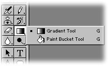
With Photoshop 6 we are given a gradient
Options Bar, similar to other tool selections like type,
paint, etc. In the immediate left of the options bar we can
select our gradient colors. You will see a gradient loaded
consisting of your fore and background colors. By clicking
the drop down arrow you will see several more selections
become available. These are presets that shipped with the
program, and actually a couple of these I use regularly.
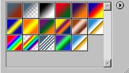
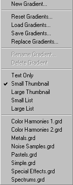
By clicking the small arrow on the gradients
drop down, you will see several options concerning the
gradients, including creating new gradients, saving those
you've created, or loading more that are available on your
system.
The other aspect of gradients we will look
at are the types of fills we can apply. This is also located
in the options bar, just to the right of the gradient
selection drop down.
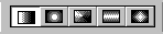
Here you can select a strait 2 tone linear,
radial, angled, reflected or diamond style fill pattern. The
linear is by far the most used, as you see it in advertising
all over the place. Also the radial gradient is the primary
secret for those realistic globes you may have seen on
various websites. Play around with all these wonderful
tools, as each renders interesting results when used
creatively.
Now that we've covered a few basics, let's
see what the gradients can do for ...what else... TYPE! Can
you tell I used to be an English major?
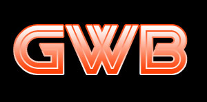
Ok, to demonstrate the dynamics possible
with gradients we are going to start with a new image, black
background. Create a new layer and enter some large type
(100 points or larger) using the type mask tool. Let's use a
red foreground, white background, and fill the type
selection from bottom to top. For this example I'm using a
free font I found online called 'Viper Squadron'. Here's
where I'm at thus far:

You will note in the example I do not have
the selection active... I did this just so you could see the
type better. Your selection should be active still.
Create a new layer and place it beneath the
type layer. Select>Modify>Expand by 2, and fill the
selection in the empty layer with the gradient again, this
time going from top to bottom.
I'm not going to use the bevel options to
dress it up this week... instead, let's create a new layer
beneath those 2. Again, fill this from bottom to top.
Select>Modify>Contract by 2, then delete the selection.
Select>Inverse, and let's run a motion blur filter on this
layer.
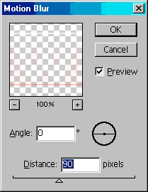
Not too bad! I love this effect... it can
look like the text is moving to some, but to me it gives the
illusion of being on lined paper for some reason. Here's
mine:

|