Inset Text
This week we are actually going to do something. This
technique is really simple and you will see it all the time
in design both for print and the web. It is not confined to
text either. Look around and you will see this technique
used anytime some simple depth is needed in an image.

Let's start with an image, mine in 250 px x
250 px that has some text in it. You should have 2 layers
here: 1. The background 2. The text. What you want to do is
to duplicate the text layer twice and move those layers
behind the original text layer. Your original layer can be
any color you want, but the other two should consist of 1
white text layer, and 1 black text layer.
Ok, now that you have that done, you should
have a layer palette that looks like this.
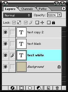
You can see that the back 2 layers are name
Text white and Text black respectively. This can be done by
changing the name of the layer in the Layer Properties
dialog box. I do this so that I can keep track of what
layers are what. It's a good idea to get in the habit of
naming your layers. When you get about 50 of them in an
image, it becomes almost impossible to tell one layer from
the next if you leave them numbered.
Now what you want to do is to select the
move tool simply by pressing the V key on your keyboard or
by selecting it in the tools palette. Use the arrow keys to
move the white layer over one pixel and down one pixel.
Depending on the size of your image, this will have to be
adjusted to your taste. Using the arrow keys along with the
Move tool is called nudging. Remember this, because you will
hear it a lot as you take these lessons and others.
Now move the black layer up one pixel and to
the left one pixel. You should now have an image that
resembles this:

Now if you want the opposite effect, that is slightly raised
text, you can just reverse the black and white layers'
positions. You will get this look:

One of my favorite things to do is to create a text layer
that is the same color as the background and then use this
technique to set it in a bit. This is what it looks like:

This is really a simple technique, so I
wanted you to have a feel for it, before we move on to more
difficult tasks. You will soon find that you use this a lot,
not only for text, but also for any geometric shape that you
want to set in a bit. Here is an example.

Here I just used the technique to create a
slight inset for the oval. The I did the same for the text.
Instant depth! Until next week, stop by jlswebsource.com for
more Photoshop.
|