Typography (Part 1)
Visual contrast and page design
Good typography depends on the visual contrast between one font and another,
and the contrast between text blocks and the surrounding empty space. Nothing
attracts the eye and brain of the viewer like strong contrast and distinctive
patterns, and you only get those attributes by carefully designing them into
your pages. If you make everything bold, then nothing stands out and you end up
looking as if you are SHOUTING at your readers. If you cram every page with
dense text, readers see a wall of gray and their brains will instinctively
reject the lack of visual contrast. Just making things uniformly bigger doesn't
help at all. Even boldface fonts become monotonous very quickly, because if
everything is bold then nothing stands out "boldly."
Use the major HTML headings sparingly. One alternative to overly bold HTML headers
is to use the physical style controls of HTML to make text bold or italic
without increasing the font size. However, you should understand that there are
some disadvantages to using physical styles to control the typography of your
Web pages. The HTML heading tags (H1, H2, etc.) are designed to identify
important titles and subtitles in your text, and are only incidentally meant to
change the visual display of the titles. If you use the "FONT SIZE"
tags in Netscape and use physical styles like "BOLD" then automatic
indexing and text analysis programs will have a difficult time analyzing your
web documents.
Visual logic versus structural logic
The framers of the original HTML standards were physical scientists who wanted a
standard means to share documents with minimal markups aimed at revealing the
logical structure of the information. Since they had little interest in the
exact visual form of the document, no precise typography and page formatting is
possible in current implementations of HTML. In focusing solely on the
structural logic of the HTML document, the framers of the Web ignored the need
for the visual logic of sophisticated graphic design and typography.
The standards organization responsible for codifying the HTML language is
responding the widespread complaints of graphic designers that the heading tags
in Web documents often produce clunky, over-large titles and subtitles. Through
style sheets and new font control tags future versions of HTML will soon allow
you to specify what size font each header level will produce in each Web page.
Thus you will be able to produce more sophisticated typography without giving up
the substantial advantages of using the conventional HTML header tags.
Type and legibility
We read primarily by recognizing the overall shape of words, not by parsing
each letter and then assembling a recognizable word:

Avoid all-uppercase headlines they
are much harder to read, because words formed with capital letters are
monotonous rectangles that offer few distinctive shapes to catch the reader's
eye:
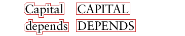
Legibility depends on the tops of words
Your choice of uppercase or lowercase letters can have a dramatic effect on
legibility. In general, use down style (capitalize only the first word, and any
proper nouns) for your headlines and subheads. Down style headlines are more
legible, because we primarily scan the tops of words as we read:

Notice how much harder it is to read the bottom
half of the same sentence:

If you use initial capital letters in your
headlines you disrupt the reader's scanning of the word forms:

References
Bringhurst, R. 1992. The elements of typographic style. Washington: Hartley and Marks.
Be inspired by this beautiful typography design from Linzie Hunter.
Siegel, D. 1996. Creating killer web sites. Indianapolis: Hayden Books.
Spiekermann, E., and E. M. Ginger. 1993. Stop stealing sheep & find out how type works. Mountain View, CA: Adobe Press.
typoGRAPHIC A concise, elegant essay on typography and letterforms from razorfish/bluedot.
Typography Part 1 |
Typography Part 2
|